Appendix E — Code and Computation
E.1 Appia
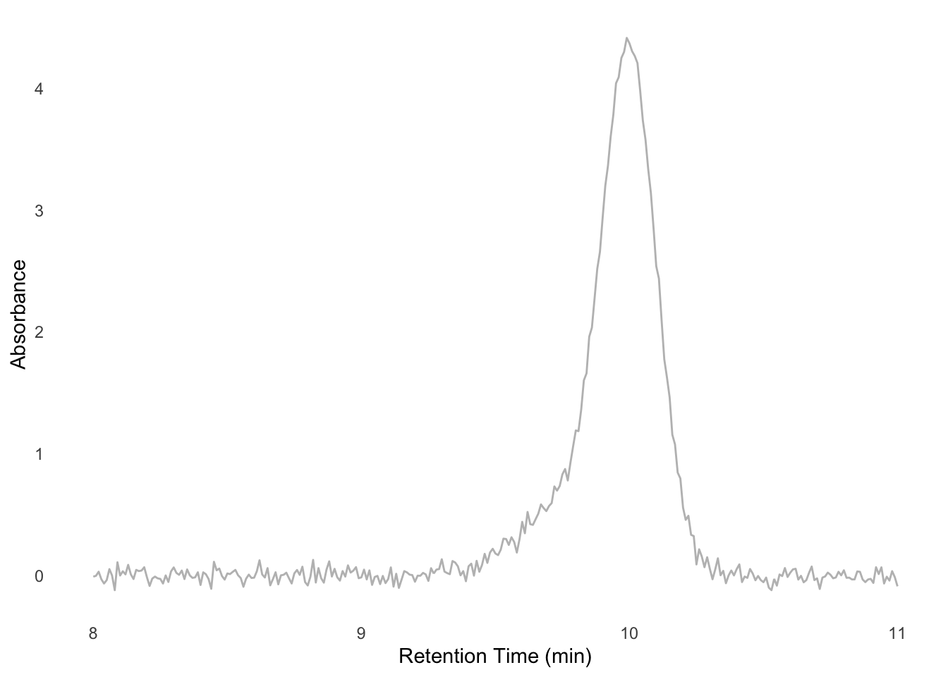
Modern structural biology makes extensive use of size-exclusion chromatography (SEC). The two types of SEC I encountered most often were analytic chromatography, in which samples are assessed for monodispersity and relative amount; and preparative chromatography, in which samples are purified based on their size. In an environment where only a heuristic assessment of these parameters is important (e.g., assessing whether a sample is homogeneous enough to make grids of, or whether a protein interacts with another) these parameters can be assessed by eye (Figure E.1). However, chromatography instrument manufacturers must include capacity for more complex analyses in their software. This necessarily makes the software more complex and arcane in the service of features that biochemists rarely need. To solve this mismatch I created Appia, a web-based chromatography visualization package1. In this section I will provide a brief summary of Appia’s functionality and intended use, the installation process, and then some guidance for adding support for new chromatography instruments.
Appia can be installed via
pip, or the source can be inspected at my github.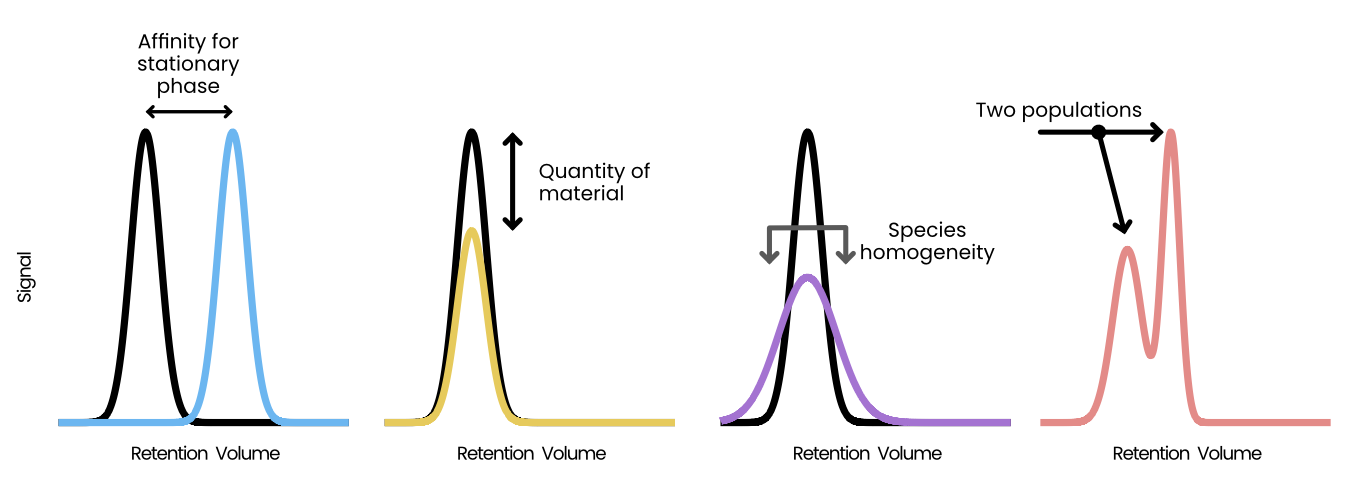
E.1.1 Structure
Appia is divided into two conceptual parts: the local processor and the web interface. The local processor is written entirely in python and processes all supported data formats into a unified Appia experiment. Several options are available at processing time, such as applying a scaling factor for various manufacturers or automatic trace plotting. Additionally, the local processor includes a user settings system. This system stores information such as flow rates to apply to a specific chromatography method and database login information. Experiments, to Appia, are collections of analytic and preparative traces. Importantly, Appia is agnostic as to the origins of the data in a single experiment — experiments may contain traces from any number of manufacturers and/or instruments, provided Appia has a processor for that manufacturer. The experiments are stored on the local machine in both long (appropriate for ggplot2 and other grammar-of-graphics plotting systems) and wide (appropriate for, e.g., Excel or Prism) formats (Figure E.2). These experiments are packaged with an experiment ID and uploaded to the other half of Appia, Appia Web.
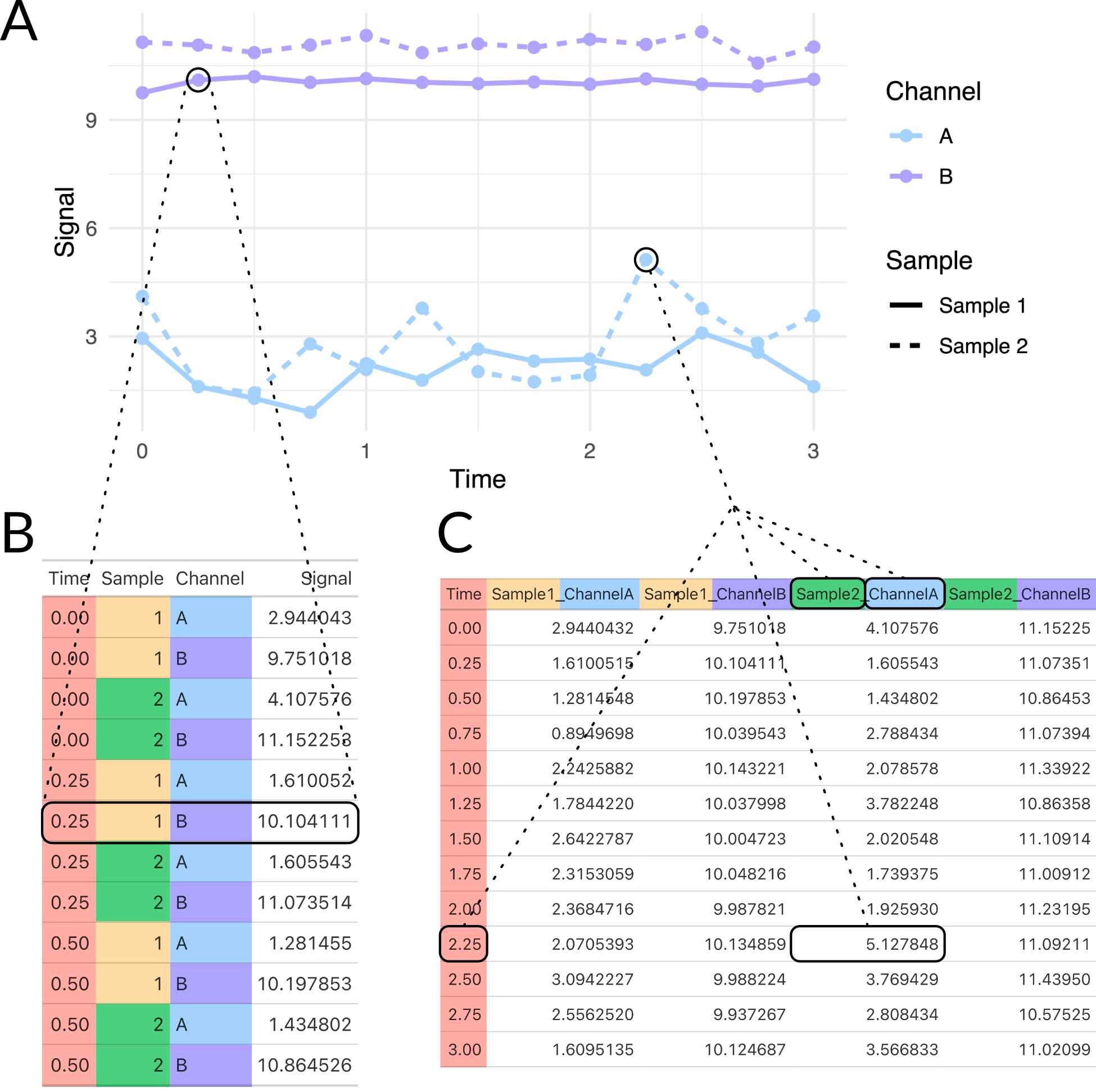
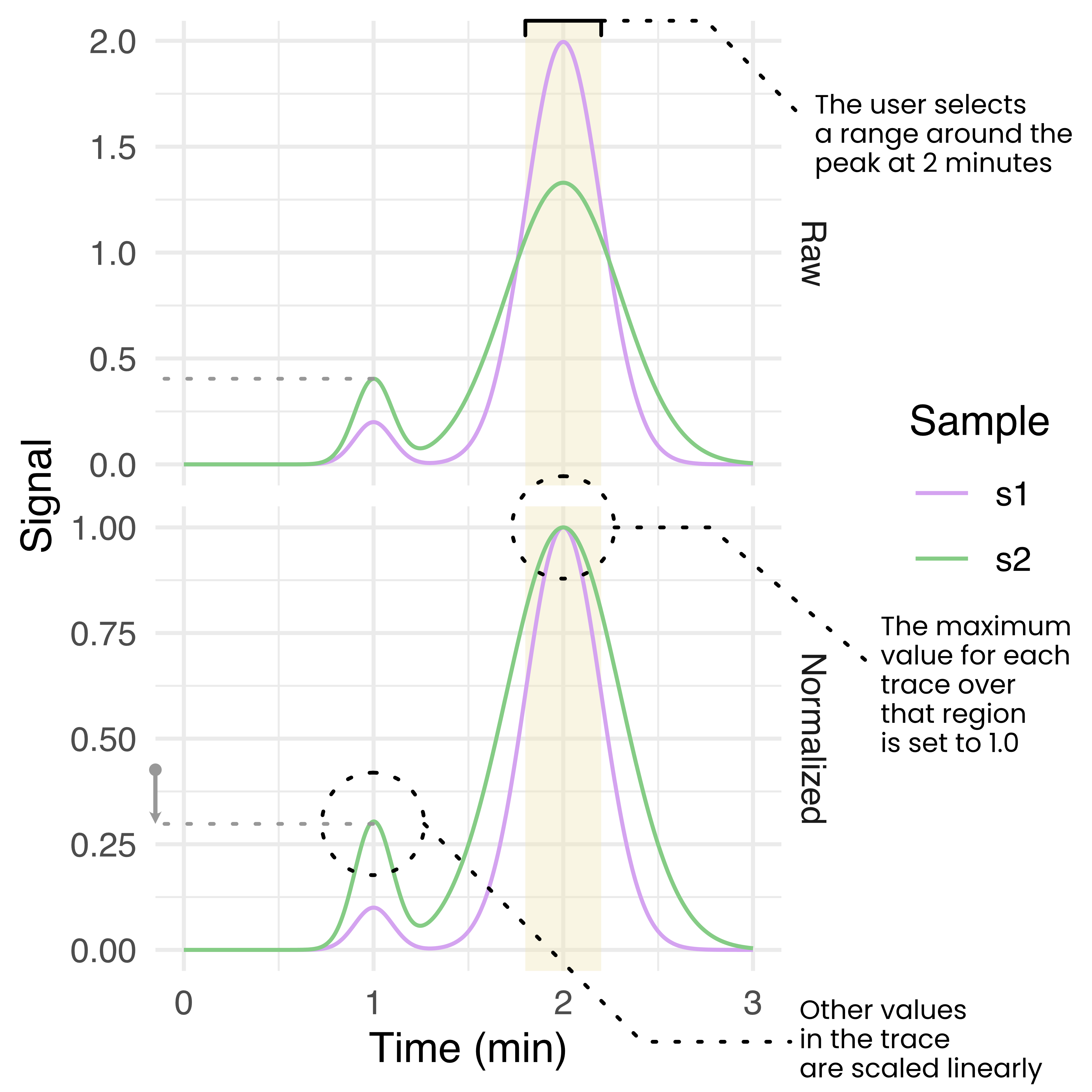
Appia Web provides a browser-based GUI and centralized trace database. The database is a CouchDB database containing a simple dictionary of experiments stored under their experiment IDs. The browser-based GUI is written in python and plotly dash, and loads user-requested data from the database and presents it using a series of line plots. Analytic data is presented with one line per sample per channel, while preparative data is presented as a single line per injection with fractions highlighted by fill. Analytic data is also presented with a normalization applied, such that the maximum of each trace is 1 and the minimum is 0. The user may select a region of the analytic traces and re-normalize them to set the maximum over that range to 1, scaling the rest of the trace linearly (Figure E.3). This normalization process is intended to aid in comparison of relative peak heights between different samples which may have a different total amount of material, or to compare peaks within a trace compared to some standard peak height. Importantly, this process uses the simple readout of peak height. More complex analyses or analyses requiring quantitative accuracy are outside the scope of Appia and should use manufacturer-provided peak calling and fitting. Users can also download images and raw data from Appia Web.
E.1.2 Installation
Appia can be used solely to locally process chromatography data into a standard format for later plotting. However, we recommend installing a processing installation on each instrument computer and a single centralized Appia Web installation on some networked computer. This allows for single-click processing and upload of data to a central repository which users can then inspect, manipulate, and download from their personal computers without installing Appia. To facilitate this process, I have created Docker images for Appia Web. Images are available for both x86-64 and ARM architectures, and docker-compose templates are available in the project repository. Running one of these templates creates and networks the database and Appia Web automatically, requiring only that the user expose the correct ports (5984 for CouchDB and 8080 for Appia Web).
Below is an example process for installing Appia Web on a Windows PC which is accessible at example.ohsu.edu:
- Install docker desktop
- Download
install-appia-web_pc.ps1and run it. Provide the desired configuration information - Run
docker-compose up -d - Ensure that ports 5984 (database) and 8080 (web interface) are accessible
The Appia Web interface would now be available at example.ohsu.edu:8080/traces. All that is left is installing the processor on the instrument computer, a much simpler process:
- Install python
- Run
python -m pip install appia - Run
appia utils --database-setupand provide the information set up during Appia Web installation.
Now when a user finishes a chromatography experiment, they first export it to whatever format Appia expects (typically the default text format) and run (assuming the files end in .txt) appia process *.txt -d to upload the data to the web interface. The files will automatically be organized and stored on the local computer as well. This command can be wrapped in a script to avoid the need for users to interact with the command line.
E.1.3 Peak fitting with Gaussian Mixture Models
One useful form of analysis that Appia cannot perform on its own, but that can be performed with Appia’s data output, is a Gaussian Mixture Model (GMM). In GMMs, we (perhaps obviously) treat our signal as a mixture of pure gaussian processes. This is especially useful when analyzing chromatography of species with known retention times. For instance, suppose that we know that a Fab binds a target, which shifts the target’s retention time from 10 minutes to 9.8 minutes. The Fab’s retention time is well outside this region, perhaps at 24 minutes, and so we can ignore unbound Fab. If we mix these proteins and look at the signal around 10 minutes, we might observe a peak like Figure E.4. We want to know what proportion of the target has shifted to the 9.8 minute retention time, since that will tell us how much has bound. However, it’s impossible to tell this by looking at the data, or even by using manufacturer-written peak integrating algorithms. However, since we know the retention times of each component, we can model the mixture ourselves. I’ll work this example in R, but it could just as easily be done in python, Matlab, or whatever modeling software the reader prefers.
Gaussian curves have two components: the mean and the standard deviation. In a chromatography context, the mean is the retention time and the standard deviation the monodispersity of the peak (i.e., its width). We also need to model the amount of the component, which we can model with a simple scalar for each component. Performing a non-linear least squares fit to the data should give us these parameters
# ub for unbound, b for bound
ub_rt <- 10
b_rt <- 9.8

# nls needs initial starting values,
# which we can eyeball.
# In this case it looks like our
# peak is mostly the unbound part
guesses <- list(
    'ub_amount' = 0.8, # real: 1.0
    'b_amount' = 0.4, # real: 0.3
    'ub_sd' = 0.15, # real: 0.1
    'b_sd' = 0.3 # real: 0.2
)

results <- nls(
    # This is the mixture model
    formula =
        signal
        ~ ub_amount * dnorm(
            rt, mean = ub_rt, sd = ub_sd
        )
        + b_amount * dnorm(
            rt, mean = b_rt, sd = b_sd
        ),
    data = example_trace,
    start = guesses
)
The results variable now contains the fitted values for each component. To see how well the data have been fit, we can plot each component separately, or their sum, as in Figure E.5.
# helper function to extract values
get_val <- function(val_name) {
    coef(results)[[val_name]]
}
# function generator for the gaussians
plot_gauss <- function(scale, mean, sd) {
    \(x) scale * dnorm(x, mean = mean, sd = sd)
}
fit_unbound <- plot_gauss(
    get_val("ub_amount"),
    ub_rt, get_val("ub_sd")
)
fit_bound <- plot_gauss(
    get_val("b_amount"),
    b_rt, get_val("b_sd")
)

data_plot +
    geom_function(
        fun = fit_unbound,
        color = "blue",
        linetype = "dotted",
        n = 1000,
        linewidth = 1
    ) +
    geom_function(
        fun = fit_bound,
        color = "forestgreen",
        linetype = "dotted",
        n = 1000,
        linewidth = 1
    ) +
    geom_function(
        fun = \(x) fit_unbound(x) + fit_bound(x),
        color = "black",
        n = 1000
    )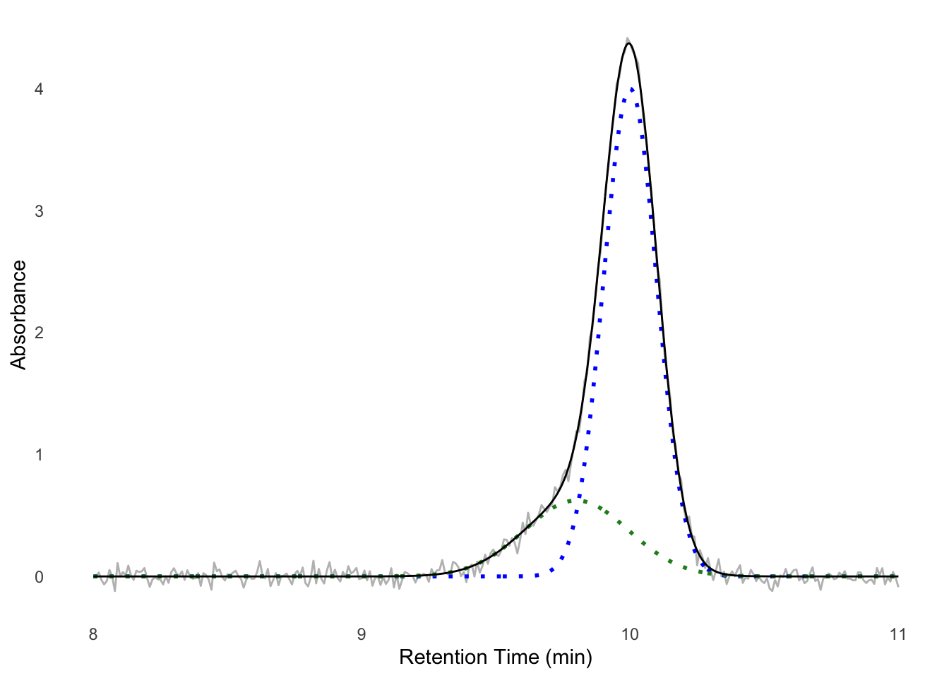
We see the data fit well — we now have a model for the components of our experiment. To assess, for instance, the amount of protein in each peak, we could from here use the well-known equations for the area of a gaussian to find the peak area for each population, or just take their height as a heuristic. If this simple sum of gaussians model does not fit, you could consider adding a constant (for a constant non-zero baseline) or parameters for a linear function (for a linearly changing baseline) to the fit formula.
E.1.4 Writing a new processor
This section is intended for the advanced reader who wishes to add support for a chromatography instrument to Appia.
Processors are each a class which inherits from either HplcProcessor or FplcProcessor (for analytic or preparative data, respectively). At the time of writing, Appia supports the following data formats:
- Waters Empower
.arwfiles - Shimadzu
.ascfiles - Shimadzu
.txtfiles - Agilent
.csvfiles - Cytiva/GE
.csvfiles
Your processor can perform any necessary setup in __init__(), but it must eventually run
super().__init__(
    filename,
    manufacturer = {appropriate_string},
    **kwargs
)
When Appia processes files, for each file, it creates an instance of every Processor child. These Processors all decide whether they can process a file using their claim_file() method, which you must implement. This method should accept a filename and return True if the processor thinks that is a type of file it can process and False otherwise. For instance, here is WatersProcessor.claim_file():
@classmethod
def claim_file(cls, filename) -> bool:
    return filename[-4:].lower() == '.arw'
It simply checks whether the file ends in .arw. Depending on the data format for the new manufacturer, the method may require more complex checks, or you may have to add more specificity to other claim_file() methods.
If your processor claims the file, it will automatically run two methods: prepare_sample() and process_file(). The distinction between these is arbitrary, as they are both always run in sequence. It is intended that prepare_sample() collects metadata about the sample (method name, flow rate, sample set name, etc.) and process_file() creates the actual data frame. The data frame must be in the long format, should be stored in your processor’s df attribute, and should have exactly the following column names:
- mL: the retention volume in mL.
- Time: the retention time in minutes.
- Sample: the sample name.
- Channel: the signal channel. Values in this column are arbitrary but should follow some kind of internal logic.
- Normalization: whether this row is normalized (“Normalized”) or raw (“Signal”).
- Value: the y-axis position for this row.
At this point, your Processor is done. As long as only one Processor claimed a file, the Appia parser will handle concatenation, plotting, and upload for you.
I would encourage you to write a test as well, of course.
The parent classes provide a few conveniences for you. For example, the flow_rate and column_volume getters will prompt the user for the relevant info, if necessary, and then offer to store it in the user settings. It will also handle overrides of various parameters, which are accepted through kwargs. Additionally, appia.processors.core provides the normalize() function, which handles trace normalization. I encourage you to take a look at the Processors I’ve already written before embarking on writing your own.
E.2 Model-building tools
I’ve written a few tools to aid with model building and general structure analysis. They’re all available on my github.
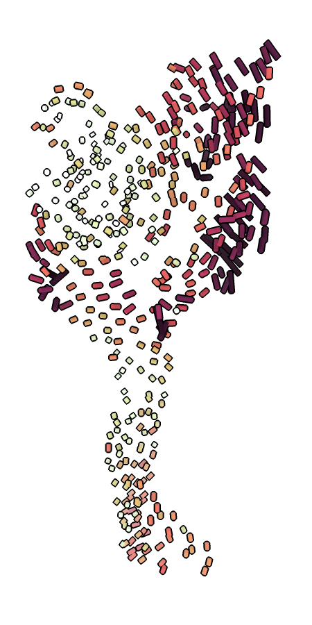
ca_bilder.py highlighting the movement of the finger and thumb between the resting and desensitized states of ASIC1.ca_bilder.py creates a .bild file visualizing Cα shifts between two given models. Cylinders are drawn between each pair of Cα atoms, colored by the distance. The colors are scaled per-model, with the darkest color corresponding to the greatest shift. The models must be aligned before they are run through the script. If the models are multi-chain, cylinders will be drawn between the same chain ID. If the models are of two different proteins, you must provide a FASTA alignment and indicate which chain belongs to which sequence. These visualizations can be useful to highlight when certain domains move while others stay still, such as ASIC1’s gating cycle (Figure E.6).
check_for_glyc.py searches a PDB model for the sequence NXS/T, the canonical N-linked glycosylation sequence. All asparagines matching this requirement are added to a ChimeraX command HTML file. Opening this file with ChimeraX creates a list of clickable asparagine names. Clicking these links orients the camera on the appropriate residue and removes the link from the list, creating a checklist of sorts. If the model and map are both open, this is a convenient way to step through all potential glycosylation sites in a model and assess whether they are indeed glycosylated. The user may then add sugars via the normal commands.
model_map.py, orientation_plotter.py, phenix-table-reader.py, and the three R scripts all read information from PHENIX or 3DFSC output and produce more aesthetically appealing plots. phenix-table-reader.py is a convenient way to automatically update a Table 1 (for instance, Table A.4) during the model building process. Output from the other scripts can be seen in Appendix D.
mutator.py checks the sequence of a model against a FASTA sequence and alerts the user to any mismatches. It also creates a ChimeraX command file which can be run to mutate the model to match the FASTA file. Any known deviations can be passed to the script as a .txt file with one mutation per line in a ChimeraX-like format. For instance, if chain A has a C→K mutation at position 260, the .txt file should have a line reading /A:C260K.
translator.py is currently ENaC specific, but could be generalized by a user. It is a simple script to translate residue numbers between the same gene of different organisms using a FASTA file. It is mostly useful when reading or writing and trying to incorporate data from multiple organisms. An example of this script in use:
$ translator.py mA260
Mouse αK260 => Human αK233
At time of writing, PHENIX adds waters to a seemingly random chain (perhaps based on proximity?) and with a number overlapping other residue numbers. This makes analysis extremely frustrating, since waters have the exact same atom specifier as other residues and are spread over the chains. water_fixer.py solves this problem by reading through a PDB file and moving all waters to chain H and numbering them starting at 1. This has the unfortunate side effect of waters not being numbered in a spatially coherent way, but it’s better than nothing.